Dashboard
The Printago Dashboard is your central hub for monitoring and managing all connected 3D printers. It provides real-time status updates, job progress tracking, and quick access to printer controls.
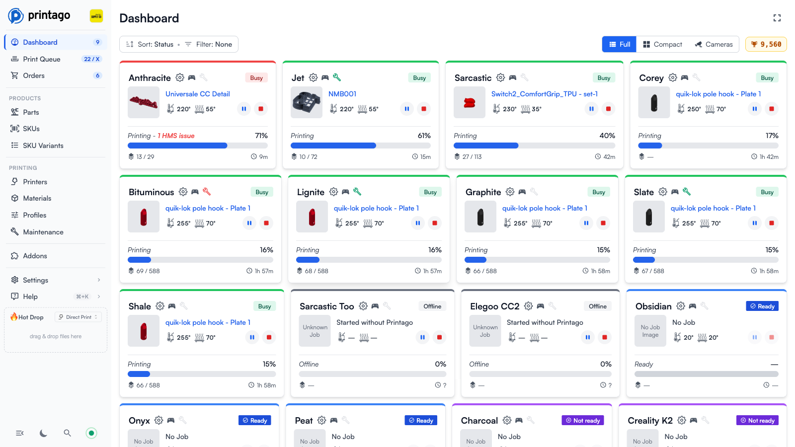
Dashboard Toolbar
The controls at the top of the dashboard let you tailor the view to your farm:
- Sort and Filter - The control at the top left (e.g.,
Sort: Status,Filter: None) lets you change how printer cards are ordered and which printers are shown. - View toggle - Switch between Full, Compact, and Cameras views using the buttons at the top right (see Dashboard Views below). Accounts in the Layouts preview also get a Layouts button here, and a card-design dropdown to the left of the toggle while Compact is selected.
- Completed job counter - The trophy counter at the top right shows your store's total completed print jobs.
Dashboard Views
Full View
The default view. Each printer card shows the current job thumbnail, part name, nozzle and bed temperatures, pause/stop buttons, progress percentage, layer progress, and time remaining.
Compact View
A condensed grid that fits more printers on screen. Each tile carries a 2px border in the printer's status colour and a matching tint, so you can read the state of a whole rack at a glance. The printer name sits along the top of the tile and stays visible whatever the printer is doing, truncated with an ellipsis when it is too long for the tile. The current job thumbnail fills the rest of the tile, and while a job is running a translucent black strip across the bottom of the image shows the time the print finishes and how long is left, with a thin progress line along the very bottom edge.

Idle printers show no strip at all: with no print running there is no finish time, no time remaining, and no progress to report, so the tile stays clean. That includes a printer that has just finished — the strip disappears with the print rather than freezing on 0s and 100%. Cards update live as printers report progress, with no page refresh needed.
The Compact view is built on card designs (see Card Designs below). Printago ships with four built-in designs: Printer overview (the default, with the job thumbnail), Printer camera, Printer mini (a small progress dial), and Printer row (a single-row summary with temperatures).
Cameras View
A wall of camera tiles from your printers. The snapshot is the whole tile, edge to edge, with the printer name, its status, and the age of the snapshot along the top, and nozzle and bed temperatures along the bottom, joined by print progress while a print is running. The snapshot age counts up on its own between frames, so a tile whose camera has gone quiet says so instead of holding at the moment it last updated. Each tile keeps a border in the printer's status colour. Printers without a camera show Not available, and cloud-connected printers that can't stream previews show No Preview.

Layouts View
Layouts and the card-design picker are in preview and are not switched on for every account yet. If the Layouts button is not in your view toggle, this section does not apply to your store yet. Compact and Cameras work for everyone regardless.
Where Full, Compact, and Cameras always show every printer in an automatic arrangement, the Layouts view shows a dashboard you compose yourself: individual cards placed on a grid, each bound to a specific printer. Build a wall display for one rack, a phone-sized board with just your problem machines, or a mixed board with a big camera card next to a row of progress dials.
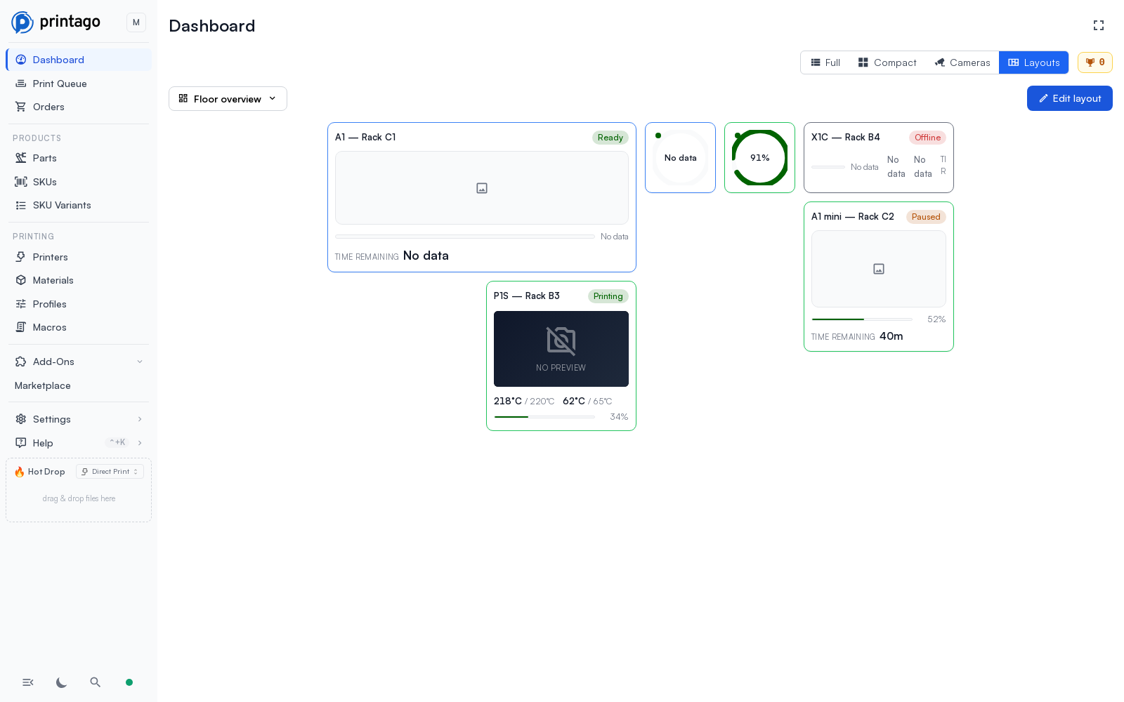
Layouts are saved to your account, so the same layouts are available from any browser you sign in on. Each device also remembers the layout it last showed, so a shop TV and your phone can sit on different layouts of the same account. One layout is marked Default and opens first on a device that hasn't picked one yet; if you delete your default, another of your layouts is promoted automatically.
The view itself is locked: nothing can be dragged or resized until you explicitly press Edit layout, so a wall display can never be nudged by accident. Clicking a card opens the same printer panel as the Compact view, and cards with pause, resume, or stop buttons work the same way they do everywhere else (confirmation first, printer.control permission required).
Editing a layout
Press Edit layout to enter edit mode. The canvas shows a dotted grid, every card gets a dashed frame, and an Add card palette appears on the left listing the available card designs, the built-in ones plus any saved designs in your store, with previews rendered from sample values.
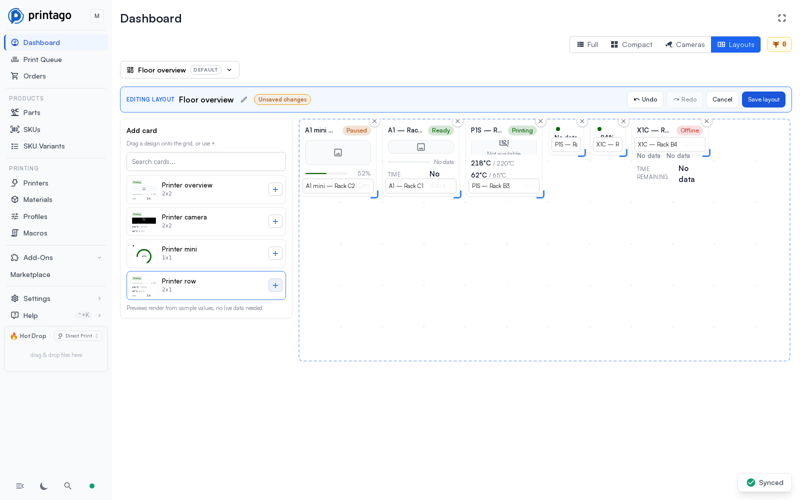
- Add cards by dragging a design from the palette onto the grid, or with the design's + button. New cards bind to the printer with the fewest cards already on the grid; change the assignment with the selector at the bottom of each card.
- Move cards by dragging them. A placeholder shows exactly where the card will land, and cards in the way are pushed down.
- Resize cards with the handle at the bottom-right corner. Sizes snap between the fixed card sizes (1x1, 2x1, 2x2, 4x2, 4x4), and a hint shows the size you are about to land on. The card's content reflows to fit each size.
- Remove cards with the x button in their corner.
- Undo and Redo (also Ctrl+Z / Ctrl+Y) walk back through your edits. The history is local to the editing session.
- Save layout stores the arrangement to your account; Cancel throws the session's changes away. Canceling a layout you just created or duplicated, before its first save, discards the layout itself, so backing out of New layout leaves nothing behind.
Managing layouts
The layout switcher at the top left lists your saved layouts with a small preview of each one's arrangement. From it you can switch layouts, create a new one (it starts from a blank grid), rename, duplicate (the copy opens straight in the editor, handy for experimenting), set your default, or delete.
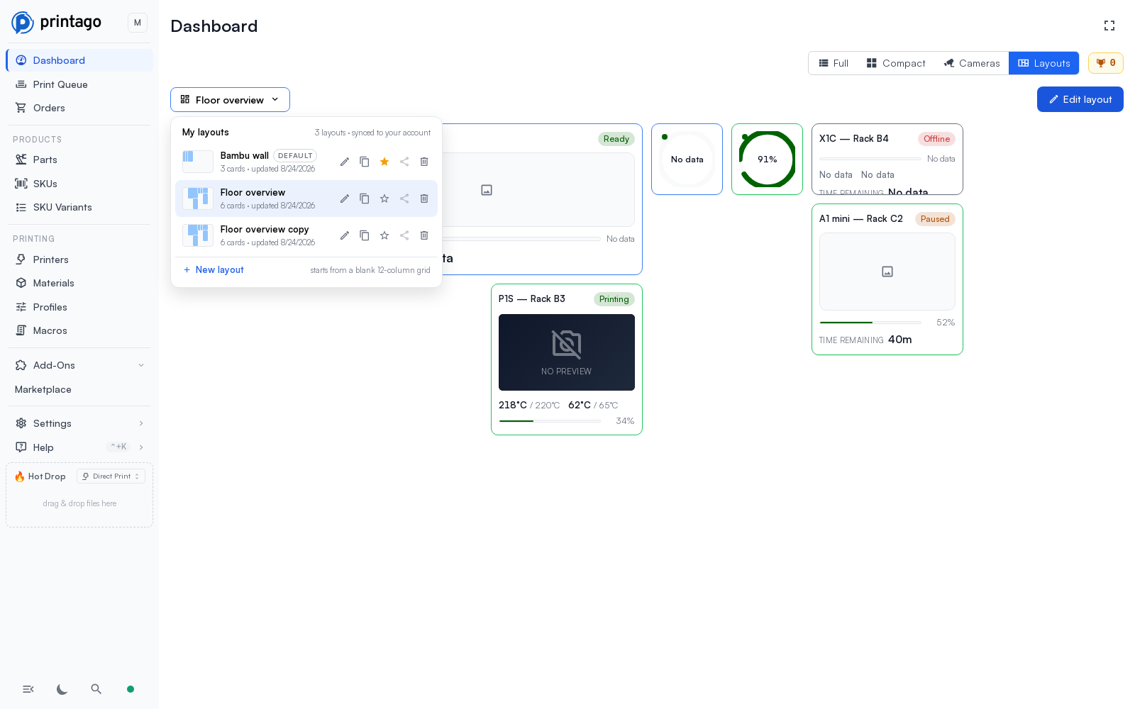
A few things to know:
- Layouts are personal. Everyone in the store can create and manage their own; nobody can modify or delete a layout that belongs to someone else.
- A card bound to a printer that was later deleted shows No printer assigned instead of breaking the layout; a card whose saved design was deleted shows Card design unavailable. Re-open the editor to rebind or remove it.
- Sharing and exporting layouts is not available yet; the share button in the switcher is disabled until it ships.
- The Layouts view needs the
layout.viewpermission; creating and editing layouts needslayout.createandlayout.edit. All standard roles include these.
Card Designs
Choosing a card design, and creating your own, are in preview and are not switched on for every account yet. If there is no design dropdown next to the view toggle in Compact mode, this section does not apply to your store yet. The Compact and Cameras views themselves are built on this same card system and work for everyone.
The Compact and Cameras views render every printer through a shared card system. A card design describes what a printer card shows (progress as a bar or a dial, temperatures, state chips, the camera, the job thumbnail, and pause/resume/stop buttons) and applies to any printer in your fleet, regardless of make or model.
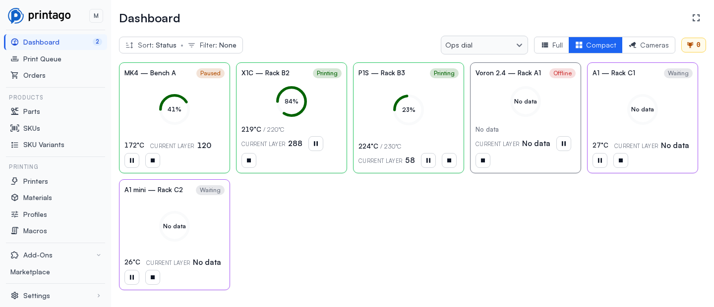
A design also chooses how the card is arranged. A plain design stacks a name row, a body and a footer inside the card's padding. A design can instead let its image fill the card: inset media keeps the padded shell and the name row and pins the footer to the bottom of the image as a translucent strip (this is what the Compact view uses), while full-bleed media drops the padding entirely and floats the name, the state and the readouts over the image itself (this is what the Cameras view uses). A design can also ask for the printer's status colour to be painted as a thicker border plus a tint over the card, rather than on the border alone.
- Built-in designs are always available and require no setup.
- Saved designs are created through the Printago API (
/v1/cards) as small JSON documents, and appear in the design dropdown for everyone in your store with thecard.viewpermission. Creating, editing, and deleting saved designs requires thecard.create,card.edit, andcard.deletepermissions. - A design's pause, resume, and stop buttons only work for users with the
printer.controlpermission, and only on printers whose hardware supports the command. Each button asks for confirmation before sending the command, and Printago tells you when a printer couldn't accept it (for example, when nothing is printing). - Designs degrade instead of breaking: if a design references data your printer doesn't provide (for example a camera on a printer without one), that element shows Not available and the rest of the card renders normally. A design saved by a newer version of Printago than the one you're running shows a placeholder card rather than an error.
Saved card designs are the foundation for shareable dashboards: the same design works on any store because it names printer data generically, never specific machines.
Printer Cards
Each connected printer is displayed as an individual card on the dashboard, providing a comprehensive view of its current status and active jobs.
Card Information Display
- Printer thumbnail - Visual preview of the current print job
- Job progress - Percentage completion of the active print
- Time remaining - Estimated time until job completion
- Layer progress - Current layer / total layers (e.g., "45/120")
- Temperature readings - Current nozzle and bed temperatures
- Pause/Stop buttons - Pause or stop the active print right from the card
Status Indicators
The colored border at the top of each printer card indicates the current printer status:
| Status | Color | Description |
|---|---|---|
| BUSY | 🟢 Green | Actively printing a job |
| NOT READY | 🟣 Purple | Connected but not confirmed clear & ready |
| READY | 🔵 Blue | Connected and ready to print |
| ERROR | 🔴 Red | Reporting an error (such as an HMS issue) |
| NEEDS CONFIG | 🟡 Yellow | Missing slicing configuration. |
| OFFLINE | ⚪ Gray | Disconnected from the network |
| STALE | ⚪ Gray | Hasn't reported status recently |
| DISABLED | ⚪ Gray | Has been manually disabled |
Job Monitoring
The dashboard displays the status of all jobs currently running on your printers, regardless of their source:
The dashboard shows jobs started from any source, including:
- Printago
- External slicers (Orca Slicer, Bambu Studio)
- Bambu Handy app
- SD card prints
This differs from the In-Progress tab in the Print Queue, which only shows jobs initiated through Printago.
Dashboard Actions
The dashboard provides quick access to several important features:
- Set Clear & Ready - After a job completes, the status indicator will switch to a button labeled
Set Ready - Quick-Set Printer Temps - Click the temps to set them without needing to open the control panel.
- Printer Control Panel - Access the Printer Control Panel via the game controller icon
- Printer Slicer Settings - Access printer-specific settings via the gear icon
- Part Navigation - View part details by clicking on the part name or thumbnail (Printago jobs only)